
Creating a great, professional looking website is probably top of every new business owner’s ever growing to-do list. With the right website, personal trainers, like all other businesses, can promote their brand and make sales.
Grow Your Fitness Brand with Trainerfu – Start Now!
Build your brand and attract more clients with marketing tools that work. Discover how Trainerfu can help you promote your business effortlessly.
Try it freeThat’s right, a great website is about much more than professionalism. It can actually play a key role in attracting and converting clients. Your website should help you grow your business!
But DIYing your personal trainer website can be a little intimidating. That’s why we want to break down the most important steps that will help you build a great website that converts.
Inside this blog:
- Chapter 1: How to choose a personal trainer website builder
- Chapter 2: Fitness website branding 101
- Chapter 3: Build out the most important website pages and content
- Chapter 4: Increase traffic with personal trainer SEO
Let’s get to it!
How to choose a personal trainer website builder
First things first, the easiest way to build a personal training website easily from scratch is by using a website builder. There are countless of these to choose from, so we want to share a little about the top three options for personal trainers.
Squarespace

Squarespace is one of the best website builder for personal trainers that can help you create a simple, yet striking website.
It has a plenty of predesigned templates to choose from, making it a great choice for non-tech savvy personal trainers that aren’t looking for too much customization. Squarespace tries to help point you toward the right template by organizing them into categories (like fitness) and the goals of your website (sell products, get memberships, market yourself, etc.). You can browse through all the templates (or just the ones the site suggests) and pick one that catches your eye.
It is possible to change colors and fonts within the templates, but you’ll find that it’s easiest to simply work from the template’s predetermined look. So, If you’re good with a more standardized site with minimalist design (which works just fine for most personal trainers) Squarespace might be the site for you.
Squarespace starts at $16 a month and goes up from there depending on your needs. For most small businesses, the starter plan or next plan up at $25 per month will offer all the features you need. You will also need to pay for your custom domain, which is typically around $15-20 per year. If you want a custom email address linked to your site, that will also be an additional fee. You won’t have to pay for web hosting.
When it comes to customer support on Squarespace, there are plenty of tutorials on the site as well as a thorough help center with guides covering a variety of topics. There is no phone support though, so if you find yourself stuck, you’ll have to rely solely on the help articles to answer any questions.
Also read, “How to Start a Personal Training Business from Scratch and Succeed”.
Wix
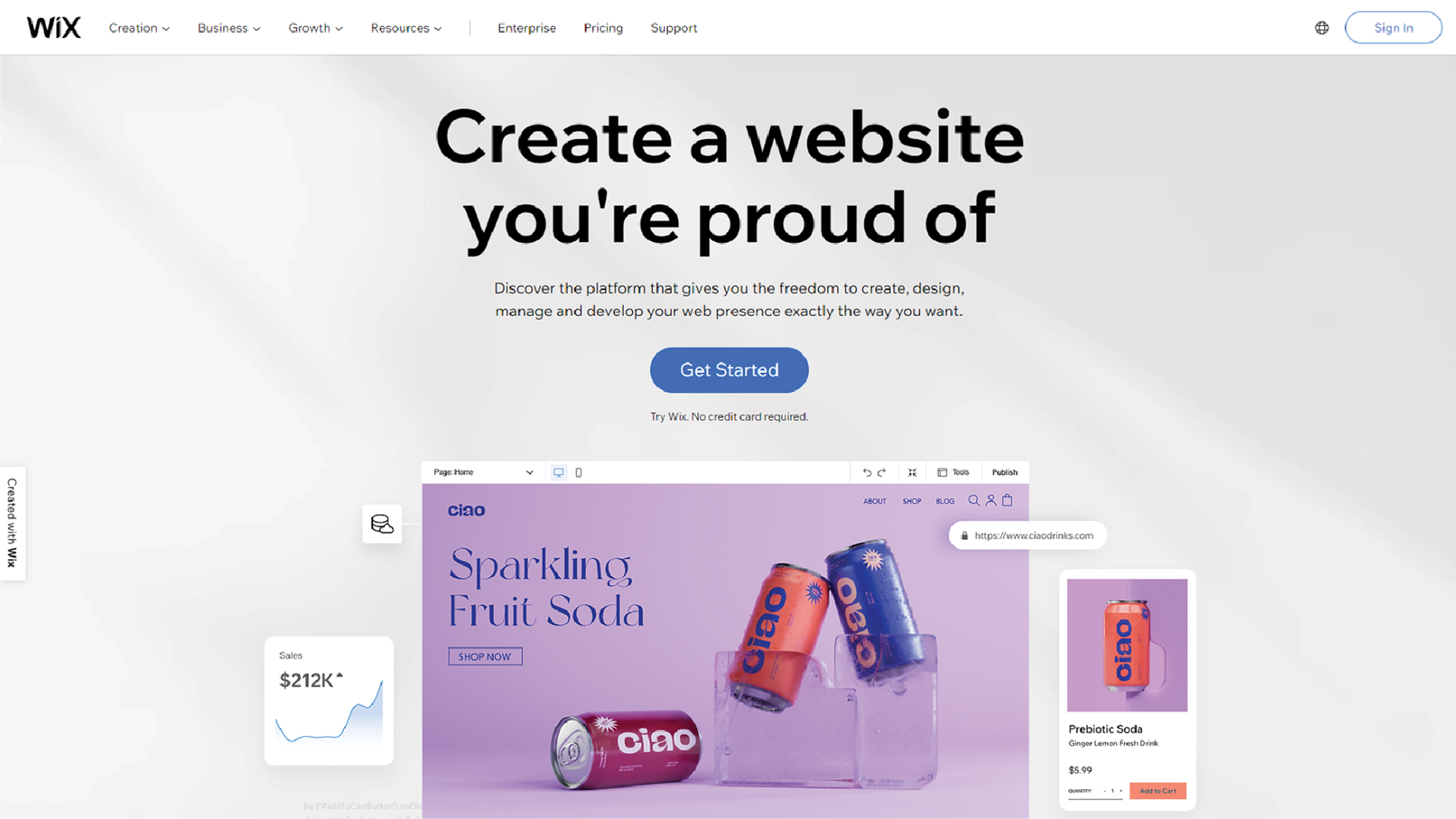
If you’ve already got a specific vision for branding and have colors, fonts, and a logo you’d like to see on your site, Wix may be a better option for you.
Like Squarespace, Wix has several prebuilt templates to use, but this website builder gives you more freedom to customize the templates. With Wix, you can move elements around more freely and change your fonts and colors. Wix has a pretty intuitive drag and drop builder that makes it easy to play around with personal trainer website design and gives you more control over the look and feel of your site.
Though not quite as simple as sticking with a predesigned template from Squarespace, the Wix website builder is easy to use and a great choice for those that want more customization.
Wix has a free plan that you can use, but know that you will have to use a Wix subdomain, and Wix advertisements will be prominent on your site. To upgrade, Wix is comparable to Squarespace with plans ranging from $16 to $45 per month with no need to purchase web hosting.
One other feature that makes Wix stand out is that in addition to a lot of helpful resources on their website, Wix also offers 24/7 customer care and phone support. This can be really important if you think you’ll need some hand holding while building your personal training website.
Wordpress
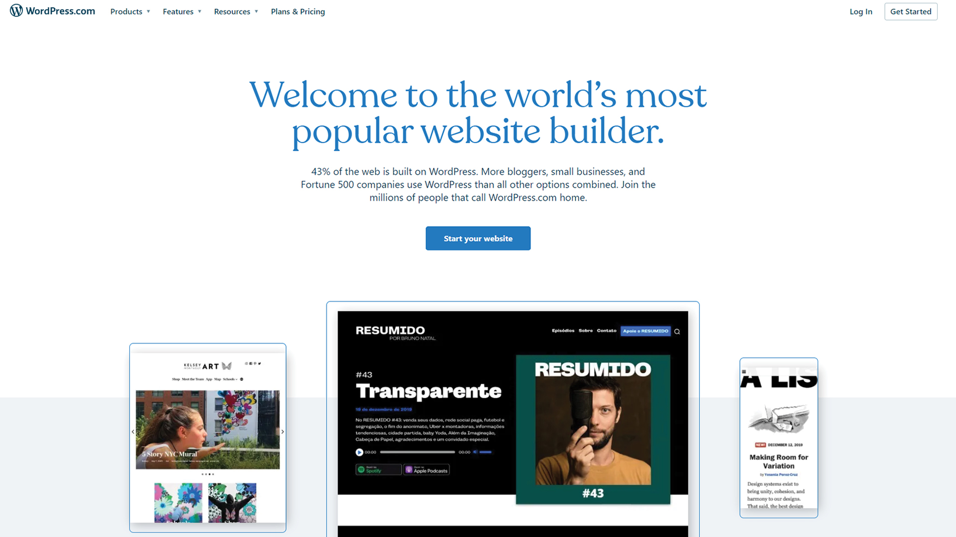
Wordpress powers nearly 40% of the Internet. Making it a pretty powerful website building tool. But before we dive too deep, let’s clear up some confusion. There are two versions of Wordpress. We’re going to talk about the version that is most fit for personal training websites – Wordpress.org.
Wordpress is a little different because it is a free platform. You bring your own domain and web hosting, which can cost as little as $3 per month. But before you get too excited about the low price, know that using this website builder is a bit more complicated than Wix or Squarespace.
Wordpress is for more tech savvy users that want ultimate control and total customization of their site. The menu bar isn’t super intuitive and it lacks the plain drag and drop designer you’d find on other sites. All sites have a bit of a learning curve, but Wordpress will likely be the most difficult and time-consuming for the average user to figure out.
That being said, it is set up to handle major customization with third party templates and plugins (like pop-up forms and scheduling tools).
If you determine that this is the website builder you’d like to use and are not tech savvy, you may want to hire someone to build the website for you. Doing this will give you a fully built out and highly functional website that looks exactly how you want it.
If you do decide to build a Wordpress site yourself, it will be your cheapest option since you’ll only pay for the cost of web hosting. Keep in mind, buying templates and plug-ins for your site will likely cost extra as well.
Before choosing a website, you can also spend a little time trying each of them out. Squarespace offers a two week free trial. Wix has a free version that you can try out, and Wordpress, of course, is free. It may take a little time to play around on all three but it can save you time in the long run, as once you create a full website on one builder, there is no easy way to transfer the existing material to a new website builder. You would basically have to start from the ground up.
Cost considerations may also play a big role in your final decision and that’s ok. All of these website builders are great options, and all will help you build a great website.
Also read, “How to Set Up Your Personal Trainer Website and Grow Your Business”.
Domain name and hosting
- If you don’t have a domain, then the easiest way would be to buy it from the website builder software company.
- Squarespace, Wix, and Wordpress provide this feature out of the box.
- If you have an existing domain then also you can transfer it to a different host yourself or use a service that will do it for you.
Fitness website branding 101
While designing your website, it’s important to keep your brand in mind. Your brand is about the story you tell, the message you convey, and how you make people feel when interacting with your business.
The main components of your brand are:
- Your message- Who’s your niche? And what problems do you solve for them? How? This is what you will convey in your messaging, again and again.
- Brand identity- This is the personality or “human” element of your brand.
- Visual identity- This is how your brand looks: colors, images, logo, fonts.
- Assets- All of the things that help you share your brand including your website.
You can see how your website will play a major role in each of these elements and serve as a platform for you to build and share your brand. For more detail about building a fitness brand, check out our how to guide here.
Creating a Logo
If you don’t already, you’ll definitely need a logo for your business. A logo is a visual representation of your fitness business. Think about some of the most famous logos – the Nike swoosh, Apple’s apple, McDonald’s “golden arches”. These logos are clean, simple, and effective.
There are a few different ways to go about creating a logo. If you’d like to try designing it yourself, you can use a website like Looka, BrandCrowd, or Canva.

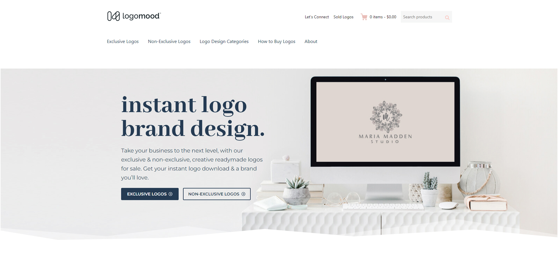
You can also buy a premade logo from sites like: Logo Mood, Logo Ground, Logo is Us. These sites are easy to navigate, and once you purchase a logo it is totally yours and no longer available for anyone else to buy.
Lastly, another great option if you have a little more cash to spare is hiring a designer to create one for you. This will be the most hands off and allow you the most customization. You can look for a local designer in your area or use sites like Fiverr and Upwork to source one.
Build out the most important website pages and content
Another huge task when creating your website is working out the necessary pages and the content that will be on them. Let’s go over the most important pages that your personal fitness trainer website needs to have and some tips on designing and writing them.
Write to your ideal client
Your ideal client is the type of person your business serves. Every personal trainer should get clear on who their ideal client is.
When thinking about your ideal client, think about your niche and the audience you are targeting. Then, you might even get more specific. List out your ideal clients demographic, hobbies, lifestyle, challenges, and fitness goals. Think about the kind of person they are, the kind of words they use, and the type of personal training they would receive the most benefit from.

As you move forward with writing your website content, write directly to your ideal client. Keeping them in mind helps you tailor all your content so that it speaks to them and helps them feel aligned with your brand and business. Think about it, you wouldn’t speak about your business to a senior with mobility issues in the same way you would a marathon runner that wants to start weight lifting!
Catch attention with your personal trainer homepage
The homepage is the most visited page on any website. So, it’s pretty important to spend time creating it with the right content. It needs to catch a reader’s attention and help them make a quick decision on whether they want to know more about your business, and maybe even buy from you.
Hero section
In this main section of your home page, the imagery and text is “above the fold”, meaning that it can be seen without having to scroll. The purpose behind this section is getting readers to scroll and explore your site a little more.
That means you need to have a powerful headline and subheadline . Your headline should be an emotionally driven benefit. What is the benefit that you provide – not the service. Then, your subheadline right underneath will explain how you deliver than benefit.

Here’s an example of what we mean: Your feature might be “Personal training from an experienced instructor of fifteen years,” but your benefit would be “Feeling better in your body than you have since high school!”
Go ahead and include a Call to Action or CTA, right here in your hero section. This might be a button that sends them to booking a consultation or maybe to another section of your website.
Social proof
Social proof is powerful. When making a buying decision, we want to know what other people have to say about a product or service. We trust individuals’ experiences more than we trust what a business is telling us about themselves.

Include social proof on your homepage to build trust and show readers that you have proven results. Ask happy clients for testimonials that you can quote on your website. Include “before and afters” along with client testimonials, or share pictures of clients having fun working out. Bonus points for video testimonials.
Introduce yourself
Your home page should also include a short section where you briefly introduce yourself. There is a pretty simple formula you can follow to write an effective bio for this section of your site.
- Who you are
- Who you help
- What results do you get?
- What are your qualifications?

Here’s this in action:
Hello, my name is Andrew. I help seniors with mobility issues fall back in love with being active! I have a bachelors in occupational therapy and got my PT certification in 2012.
Hi, I’m Desiree. I teach working moms how to get fit in under 30 min a day, helping them shed weight quickly! I have been a physical therapist for nearly ten years and have owned a fitness studio since 2018.
End this section with a link to your “About Me” page where readers can learn even more about who you are and what you do.
Services
Briefly touch on your services on your home page. Highlight your main two to three offerings with brief descriptions under each.

For example:
1
2
3
    * Online personal training
    * Fitness Challenge
    * 1-on-1 in-person training
Keep talking to your ideal client in this section. Tell them a little about each service and what makes it a great choice for them. Include links to each individual service page where interested readers can learn more.
End section
End your homepage with another strong CTA. CTAs are supposed to drive action and encourage readers to take the next step. In this section that step might be scheduling a consultation, downloading your lead magnet, joining your newsletter, etc.
Craft a great personal trainer bio page
Your actual about me page will be an extended version of the introduction you did on your home page. You will want to use this page to share a little bit about yourself of course, but also keep in mind that this page should also be about your client. Think about tying your own experience back to how it helps you clients.
Let’s look at the components that every bio page needs:
Who you are
This is where you will share your qualifications like your educational background, certifications, and relevant experience.
You’ll also want to help people feel like they know you on a more personal level by sharing pieces of your identity. Don’t get caught up feeling like you need to tell your life story, but think about how you relate to your ideal client and share those parts of yourself with them. Talk about the other hobbies and passions that you have, a little bit about what you do when you’re not working. Are your ideal clients parents? Maybe talk a little about your children or include a family photo on this page.
Who you help
We already talked about getting clear on your niche. This is the type of people you help. Help website visitors decide if you are the right client for them by telling them exactly who you help and how. Get specific – don’t be afraid about pushing away the wrong clients, you’re looking for your ideal client and want them to know when they’ve found you.
Here are some examples:
- I help Fremont residents lose weight without them having to go on restrictive diets.
- I help seniors who are mostly cooped up at home get back into a more active lifestyle.
- I help busy moms find more energy and feel beautiful in their own bodies.
What’s your story?
What makes you special? Why do you want to help these people and how do you do it? What’s your motivation?
This step is where you differentiate yourself from others in your field, and explain to your prospects what makes you unique and better.
“I tried every diet out there: paleo, vegan, gluten-free, keto, you name it. Then I realized that strict dieting wasn’t for me or my body, and figured out how to achieve weight loss by eating whatever I wanted (within reason!).
“It’s both my belief and experience that you don’t have to follow some crazy strict diet to lose weight and live your best life.”
Why should they trust you?
Your entire bio will help you build trust with readers and establish your expertise. This section is dedicated to reinforcing that with proof.
Show website visitors actual results you have gotten clients. You can include several testimonials or short blurbs from past clients. Use photos, if possible, of whose success stories you’re sharing. This will make them (and you) more real and relatable to the reader, in turn building further trust and interest.
Sell with service pages
When building your personal trainer website, it’s crucial to have pages dedicated to your services. This is the best way to show people what you offer and give them a quick sales pitch on each offering.
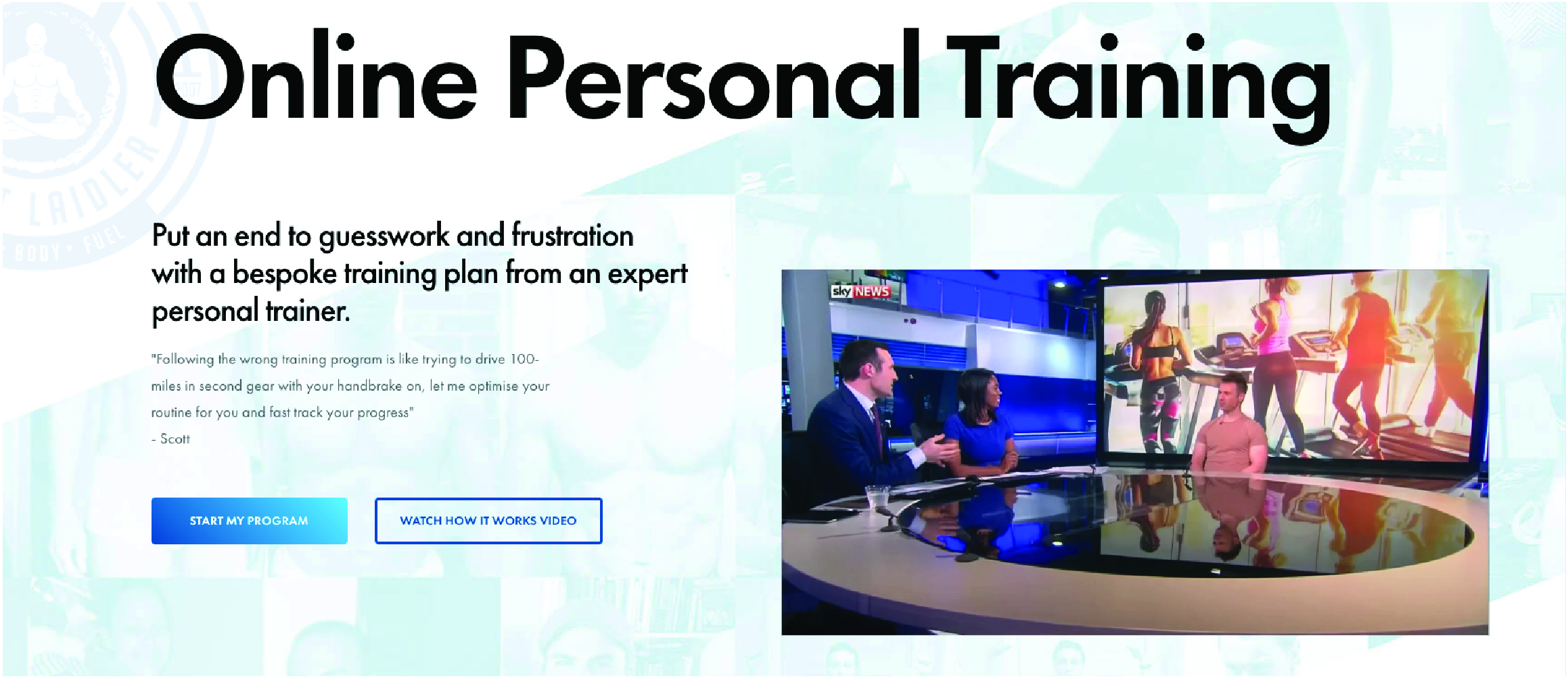
Every service page should have an SEO focused title, like “personal trainer NYC” or “bootcamp Sunnyvale”. This will help your website come up when someone is searching for a particular service on Google.
Here’s how you can lay out each service page:
Hero section
Keep this section simple, but strong. Here’s your formula:
- Headline - Name the service.
- Subhead - Explain the benefit of the service.
What’s included in the service?
The next section on this page should get more detailed on what the service entails. Explain to readers exactly what they will get. A certain number of dedicated one-on-one sessions? Unlimited access to online resources? How about additional content like habit coaching and nutrition guides. List it out in bullet points.
Your process
Up next, tell clients how you deliver the service. Let them know what it would be like to work with you and what they can expect throughout the process. You may even include a “FAQ” section where you can discuss typical client questions head on.
Pricing
Consider including a pricing range under each section, that gives prospective clients an idea of what it might cost. Really building out the sections above this one, will make it easier for people to understand what all is included in a service and wrap their minds around the pricing for it.
Let readers know that they can reach out to you if they have any questions about a particular service that you didn’t answer, and include a CTA for them to sign up if they are ready.
Add high quality images
Lastly, each page on your website should include high-quality, eye-catching images. If you have the means, you can hire a professional photographer to take some brand photos of you and your gym or studio.
However, you can also find high quality images online (free and paid) on sites like Buffer or Envato. Make sure that images align with your brand.
Increase traffic with personal trainer SEO
As we mentioned earlier, your website should work for you to help you make sales. The best way to make sure that your website is getting in front of the right people is through Search Engine Optimization – or SEO.
This really important and totally free marketing tool can make a huge impact on your site’s visibility. Let’s break down the main ways to improve your personal trainer SEO.
1. Optimize for Google Business.
Set up your Google Business profile by providing relevant and accurate information about your business including your address to Google. Google will then send you a PIN via mail that you can use to verify your address.
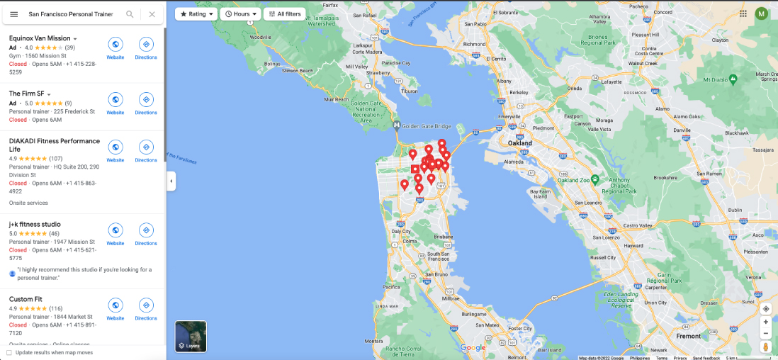
Once that’s done, within a couple of days you should see your business included on the ‘map pack’ that Google displays when users in your area enter a search for your type of service.
Fitness businesses that go through the effort of setting up their Google Business Profile enjoy a massive advantage over competitors and may even see their listing in one of the tops spots on Google.
2. Get local citations.
Citations are online mentions of your fitness business, which usually display your business name, address, and phone number—collectively known as NAP (Name, Address, Phone).
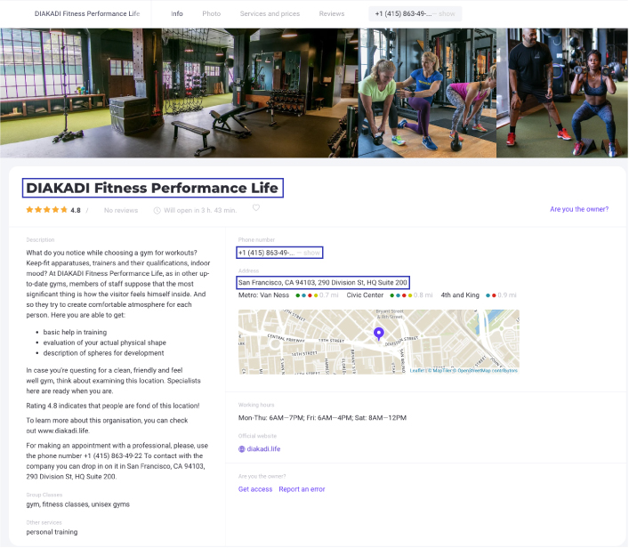
Local citations are important because they are a top ranking factor and can help you show up in searches that aren’t done on Google, like directories and Facebook.
You will want to make sure your existing citations are correct and seek out new ones. Use Whitespark’s local citation tool to find citation opportunities. Just enter your location and some keywords related to your business (e.g., personal trainer). The tool will do the heavy lifting for you to find citation opportunities for your business.
3. Optimize URL, title tags, headers, meta descriptions, and content.
A big part of SEO is incorporating the right keywords (like what you do and your location) in the right places on your website. You should make sure that your homepage and any other important pages reference your location in four key places:
- Title tag
- Headings
- Body copy
- Meta description

Additionally, it’s worth adding the location in the URL where relevant.

For example, if you offer personal training, bootcamp, and yoga in San Francisco, create three separate pages with three separate URLs, for example:
www.fitbiz.com/personal-trainer-san-francisco
www.fitbiz.com/bootcamp-san-francisco
www.fitbiz.com/yoga-studio-san-francisco
URLs that have a keyword have a 45% higher click through rate.
4. Seek out online reviews – especially via Google
Google has this to say about reviews on Google Business Profile:
“High-quality, positive reviews from your customers will improve your business’s visibility and increase the likelihood that a potential customer will visit your location.“ Source: Google Business Profile Help

This is a fairly large hint that Google treats Google Business reviews as a ranking signal. So, it’s important to encourage any customers who are happy with your product or service to leave a review.
You can use ‘Google Place IDs’ to send your satisfied customers a direct link to a page where they can leave a review. Google provides some useful information on how to do this on its Google Business Help site.
Not only can these reviews help to give you a positive ranking signal, but the little stars beside your business name that appear after a customer writes a review will also help your business stick out from the crowd on Google’s map results.
5. Create local content.
Google continues to get smarter, which means content creators are now able to truly write for users, not search engines. But while writing about general topics will attract a wide crowd, sometimes it’s more important to hone your focus and write about local or industry news to attract a local audience.

Be the local authority for your industry by promoting local industry gatherings, news, employees, and other educational content on your blog. Think of top-of-the-funnel content that goes beyond what your business sells.
For example, do you have a lot of great walking tracks or outdoor gyms in your city? Why not create a guide that shows locals and visitors alike where they can have fun being active outside in your area.
6. Ensure your website is mobile friendly
Nearly 60% of all Google searches are performed on a mobile device, so it’s important to make sure that your website is just as easy to view on a phone as on a computer screen.

Some of the most common ways people will use your site in a mobile environment is to look up reviews, find directions to your location, and search for contact information.
Make it easy for your prospects and customers by making your site mobile friendly. Most website builders will let you see a preview of your site’s mobile version. Make sure everything loads correctly and that the formatting is ok. Avoid large blocks of text if possible, aiming instead for short paragraphs that are easy to scan.
7. Get inbound links with relevance and authority.
Inbound links are incredibly powerful opportunities to boost your local SEO. Inbound links (or backlinks) occur when another site directly links to your website or content in theirs. Every inbound link tells Google you’re a legitimate company, which can also raise your domain authority.

Here are a few ways to get inbound links:
- Sponsorships or partnerships
- Guest blog posting
- Start with your own personal network, which may include the Chamber of Commerce, business improvement districts, licensing bureaus, trade associations, resellers, vendors, and/or manufacturers and other affiliates
- And a slower, but effective way – create great educational/informative content that is so good, people want to reference it on their own websites
There you have it – this Ultimate Guide should serve as a great resource for creating your own personal trainer website from scratch. By following these steps, not only will you have a great looking site, you’ll also have a functional website that helps you attract new clients and grow your business.
Be sure to check out some of our other resources for personal trainers, including a ton of marketing guides that can help you take your fitness business to the next level.
Frequently Asked Questions
1. Why is a personal trainer website important?
A personal trainer website acts as a central hub for promoting your services, attracting new clients, and converting leads. It showcases your brand, offers credibility, and enables seamless client engagement.
2. What are the essential components of a personal trainer website?
- Homepage: Introduces your brand and services.
- About Page: Shares your story and expertise.
- Services Page: Details offerings like training packages or nutrition coaching.
- Contact Page: Provides an easy way for clients to reach you.
3. How important is branding for a personal trainer website?
Branding ensures consistency in messaging, visuals, and client experience. It involves your logo, color scheme, and tone, all of which should resonate with your target audience.
4. How can SEO improve a personal trainer website?
Search Engine Optimization (SEO) increases visibility on search engines by targeting keywords like “personal trainer near me.” This attracts organic traffic and potential clients.
5. How can personal trainers increase website traffic?
- Use SEO to rank higher on search engines.
- Share your website link across social media and emails.
- Offer free resources like workout guides to attract visitors.
Other Useful Resources:
• Ultimate Guide to Instagram Marketing for Personal Training